Annotated Bibliography, by Angus Forbes
Kosara, R. Visualization Criticism-The Missing Link Between Information Visualization and Art. In Proceedings of the 11th International Conference Information Visualization (2007), IEEE Computer Society, pp. 631–636.
Robert Kosara discusses the differences between the burgeoning field of information visualization and the more general realm of visual communication. In particular, he envisions an evolving classification system based on aesthetic criteria which can bridge the gap between design, art, and technical or pragmatic information visualization. These "rules", which generally arise ad hoc out of practical considerations, and which are measurable by quasi-quantitative methods such as counting mouse clicks or polling for user satisfaction, should instead be defined by an engaged criticism such as occurs in the world of art. That is, the tension between art creation and art theory leads, he believes, to more interesting conversations about the meaning and function of art, and thus a new sub-field of "visualization criticism" could have the same results in strengthening the field of information visualization. This field would unify common concepts of critical thinking and criticism, helping to build a bridge between the technical and the artistic. He derides ad hoc methods of evaluating work based on interaction and visual "efficiency" and wants to build a foundational theory based instead on aesthetics and principles of communication. He believes that the current method of presenting information visualization research at conferences via research papers stifles innovation in dynamics, aesthetics, narrative presentation, and interaction, since these aspects of information visualization projects can not be adequately presented in that format. That is, information visualization should not be confined to the academic realm of computer science or engineering, but instead needs to be engaged critically through methods taken from art criticism, which have the freedom to evaluate "the sublime" and other less easily quantifiable aspects of a project or research agenda. Although Kosara does not posit specific rules or specific methodologies, he does mention a few common sense bases for how this visualization criticism might look when not relying on an engineering quantification metric. For instance, visualization critics should strive to use the neutral voice; they should use facts rather than anecdotes when making their points; their criticism should not be self-promoting, their ideological motivations should be apparent, etc. Having a discourse about information visualization outside of the technical realm would allow designers of visualizations to draw from existing solutions, but also "from principles and guidelines that are applicable in a much broader way."
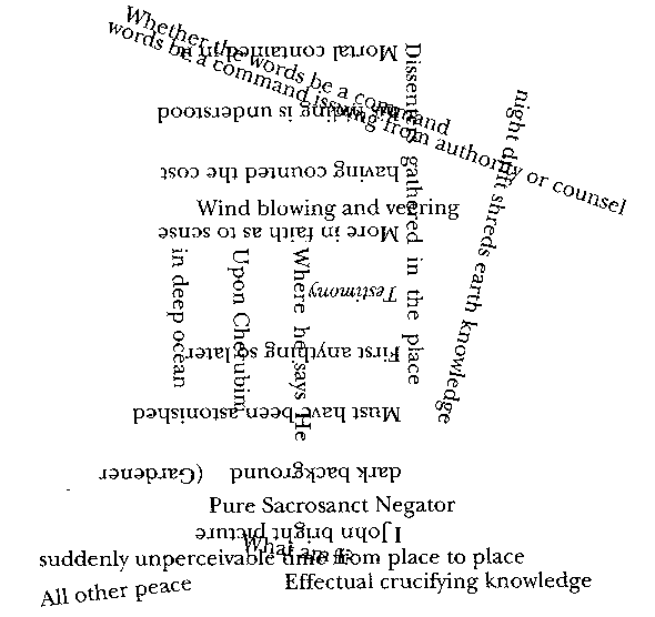
Howe, S. The nonconformist’s memorial: poems. New Directions, 1993.
In this collection of poems, Susan Howe examines a crossroads of literature, history, commentary, and interpretation using a series of texts including The Gospel According to St. John, Edward Almack's A Bibliography of the King's Book; or, Eikon Basilike (the book in question being allegedly written by King Charles I prior to his execution and distributed posthumously), and excerpts from Melville's Marginalia where he comments in pencil on the writing of Mary Shelley and James Clarence Mangan (who allegedly was an inspiration for the scrivener Bartleby). The poems themselves examine meaning creation and canon creation by examining, quoting, splicing samples from a network of historical facts, secondary sources, suppositions, and interspersed with poetic reflection. The presentation of these various voices is typographically conflicted-- sentences appear upside down, at sharp angles, overlapping each other, interfering with or at least challenging comprehension as if to reflect the undercurrents of confusion and chance that create narrative.
Twardy, C. Argument maps improve critical thinking. TEACHING PHILOSOPHY. 27 (2004), 95–116.
Charles Twardy describes a graphical system of summarizing arguments by mapping the logic of an argument with the help of a computerized software system. In particular, he claims that this system-- Reason!Able developed by T.J. van Gelder-- successfully functions as an aid to teaching critical thinking to incoming college students. The metric for evaluating successful critical thinking includes tests which ask students to point out whether a conclusion is valid based on the claims provided. The software gives students the ability to map the logic of an argument to determine if its claims are indeed valid. These maps are generally tree-like, where each statement feeds into other claims and ultimately a conclusion. By having students explicitly map out the claims of some argument, they gain practice in determining the reasonableness of its conclusions. A main accomplishment of the creating "argument maps" is that it forces students to explicitly describe and evaluate implicit claims. Moreover this is done without requiring the apparatus of formal logic notation, which Twardy believes tends to confuse students rather than aid them to think critically. The bulk of the paper describes Twadry's experience with using Reason!Able in the classroom and his estimation of which aspects worked especially well. For instance, the software asked students to categorize claims (for instance from editorials in a newspaper) as "common knowledge" or "expert opinion". Although the steps involved in creating an argument map could be reproduced on paper, the software encourages trial-and-error which would be time-consuming without the software tool. After some practice, students were able to map more abstract philosophical arguments successfully (e.g., Hume's argument against necessary connection). The paper cleverly ends with an argument map of the paper itself which details the reasoning that goes into the claim that argument maps improve critical thinking.

(An updated version of the Reason!able software, called Rationale, by T.J. van Gelder, can be found at http://rationale.austhink.com. Because it is not free software it may not be appropriate for inclusion in the Toy Chest, although a evaluation version can be downloaded.)
Horn, R. Knowledge mapping for complex social messes. In presentation to the “Foundations in the Knowledge Economy” conference at the David and Lucile Packard Foundation, July (2001), vol. 16.
The outline for this lecture describes Horn's attempts at creating a "visual language" for describing the major concerns of various knowledge domains and also the important factors in policy decisions. He creates information "murals" which clearly describe relevant knowledge for what he calls "social messes"-- difficult problems requiring interdisciplinary approaches. In particular, a "social mess" is complex, ambiguous, and confusing, and presents a problem that has no clear cut solution. His recent "mappings" are top-down: they start with a problem and use the constraints of the problem to introduce the fields of knowledge that potentially offer insight into it. The mapping then attempts to explicitly visualize various points of view from different disciplines and various values from different communities. According to Horn, his maps "form a kind of embedded executive summary of the interlinked set of problems" using informal language that allow a wide range of people to have a shared "mental model" of a complex problem. The map replaces written reports and facilitates communication and ultimately action, circumventing "sprawling" policy debates, the need for deciphering sophisticated data models, political power struggles, and the various "structural constraints" of organizations. Horn describes a "visual syntax" upon which his murals are based which provides participants (i.e., viewers) with a methodology to make informed deliberations. In particular (directed toward the audience at the Packard Foundation where this lecture was given) he believe that knowledge maps also help outsiders make evaluations when experts from different fields disagree, when new research agendas are proposed, when there are competing evidentiary claims, and when new subfields emerge.
(A large example focusing on on energy policy can be found here: http://stanford.edu/~rhorn/a/recent/Clmrgy.pdf)
Manovich, L. Cultural Analytics: Analytics and Visualization of Large Cultural Data Sets. unpublished ms (2007).
In this proposal, Lev Manovich asks if it is possible to create quantitative measures of cultural innovation. And if so, whether or not these measures can be used to create visual maps of "global cultural production and consumption" which are sufficiently temporally discrete so that a representation of the flow of change in various cultural mediums-- music, design, art, finance-- could be presented. The goal of the cultural analytics is to create detailed interactive visualizations of cultural flows which provide "rich information" that can be presented in different formats. These cultural data sets are conceived of in the same scope as other global data sets such as those created by various scientific endeavors. For instance, he compares forms of cultural data to real-time maps of global computer networks and also to real-time maps of the range and intensity of an earthquake. Manovich makes a point of differentiating these dynamic contemporary data sets with the historical data sets that are more often used in cultural analysis within the humanities. The interdisciplinary nature of this nascent field draws on digital humanities, social sciences, statistics, data mining, information visualization, and art. A primary question is whether or not this project is actually possible-- Can cultural data be meaningfully extrapolated at all? Manovich discusses the (mainly technical) reasons why current data projects fail to provide effective global cultural analyses and points to possible ways to provide these. Looking at current art or information visualization projects, Manovich notes that they use relatively small amounts of data (compared to what is available via Google, Amazon, or that is captured from scientific sensors.) That is, they are constrained by the data, or at least the form of the data, rather than motivated by the "more challenging" theoretical questions and agendas that the creator might desire. Moreover these projects don't do any sophisticated data analysis and also do not in general do a good job of layering multiple sets of dynamic data. In particular, he points to the field of digital humanities and notes that the representations of textual data are not transformed into "compelling visualizations", and also that, inherently, the data sets are limited to texts (as opposed to images, statistical information, etc) and generally static, historical, canonical, "high-culture" texts at that. Manovich summarizes the "new paradigm" of cultural analytics by outlining a series of steps that encapsulate its agenda, which include: a focus on visual data; using extremely large contemporary global data sets; the use of data analysis, feature-extraction, clustering, etc.; formatting output to work on very large, high-resolution displays; and a focus on non-corporate agendas. As a overarching goal, he wants to be able to track and visualize the flow of cultural ideas and influences to provide "the first ever data-driven detailed map of how cultural globalization actually works". Manovich ends the proposal by describing in more detail three plausible examples of cultural analytics. The first involves the visualization of abrupt cultural transitions and the spread of various cultural "memes" across different communities, such as the spread of particular styles of music, changes in the characteristics of video games, the popularity of search terms and strategies. A second visualization is a kind of global mash-up of cultural data distilled via various web commerce systems (book sales, music sales, financial data, etc). A third project includes mapping of "massively multiplayer" virtual worlds and games using the data generated by the players and analyzing the emerging economies and social structures which occur.
Comments (0)
You don't have permission to comment on this page.